The Project
Client: Movement As Medicine
Deliverable: Custom WordPress website, content strategy, accessibility features, analytics, scheduling, and lead capture
Location: Atlanta, Georgia
Website: MovementAsMedicine.net
The Client
Movement As Medicine is an Atlanta-based practice founded by Andrea Pack, PhD, CLMA, RSME/T. Dr. Pack combines more than 15 years of motor-systems research with somatic movement therapy. Her work helps clients manage chronic pain, improve balance and coordination, regulate their nervous systems, and move with greater ease.
The practice offers one-on-one movement therapy, workshops and education, and neuroscience-informed consulting.
The Challenge
Dr. Pack’s work is highly specialized. The website needed to explain sophisticated ideas about neuroscience, chronic pain, stress, and movement without becoming overly academic or clinical. It also needed to establish her professional authority while still feeling warm, personal, and approachable.
Prospective clients had to quickly understand what Movement As Medicine does, who the practice can help, how Dr. Pack’s approach is different, what services are available, and how to schedule a consultation. The finished website needed to feel like the practice itself: calm, thoughtful, credible, and deeply human.
Designing a Feeling, Not Just a Website
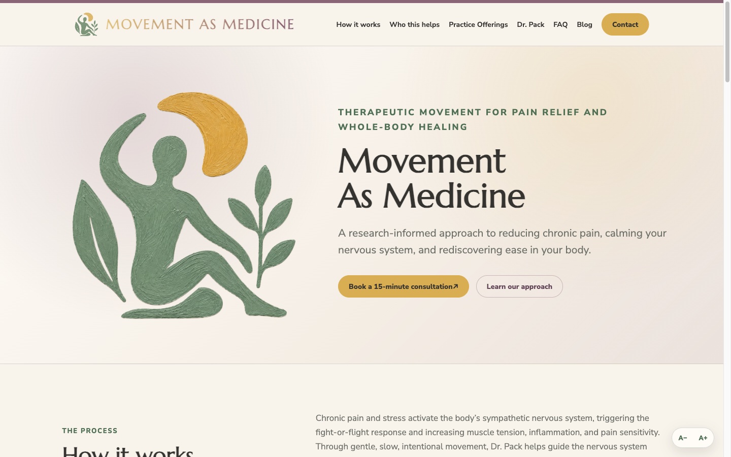
From the beginning, Movement As Medicine and Web Experts shared a clear goal: the website should communicate tranquility before a visitor reads a single word.
Achieving that required close collaboration. Together, we developed a color palette and typography system that reflected the character of the practice—grounded, intelligent, natural, and calm.
We explored warm greens, soft plum tones, muted golds, and gentle neutrals. Each color was considered in relation to the others. We studied how the palette appeared in headings, body copy, buttons, illustrations, backgrounds, and transitional elements across different screen sizes.
Typography received the same attention. The selected font combination needed to feel professional enough to support Dr. Pack’s scientific credentials while remaining warm and approachable. Heading sizes, line spacing, paragraph widths, and text colors were refined repeatedly so every page would feel spacious, comfortable, and unhurried.
The Details Other Projects Often Skip
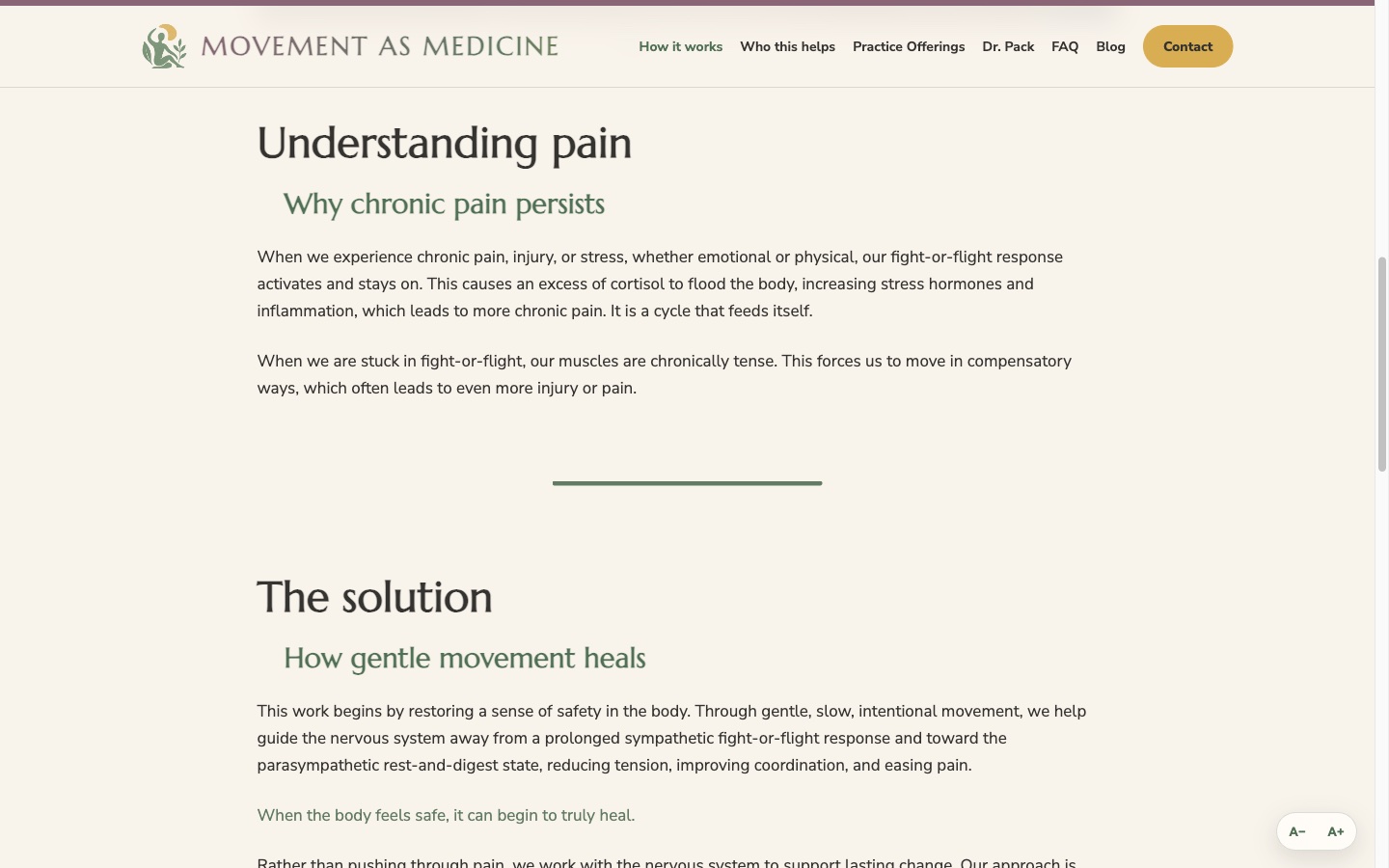
Some of the most important work involved elements visitors may not consciously notice. We spent considerable time refining details that are often treated as afterthoughts: the precise shade of a heading, the space between sections, the softness of a gradient, and the speed at which one color transitions into another.
Instead of relying on abrupt visual dividers, we created exceptionally slow transitions between green, dark plum, and light plum. These subtle movements appear in carefully selected areas of the website, adding warmth and continuity without becoming distracting.
The transitions are intentionally restrained. Their purpose is not to announce that the website is animated. They quietly guide visitors from one section to another and reinforce the calm, measured quality of Dr. Pack’s work.
Even a small gradient line between two sections received careful consideration. Its width, thickness, colors, timing, and surrounding space were adjusted until it felt like a natural pause rather than another decorative element.
Transforming the Logo
The visual identity also evolved through the collaboration. Rather than presenting the logo with a perfectly mechanical, digitally rendered appearance, we developed a painted interpretation of the mark. The softer edges, organic texture, and natural variation give it a more grounded quality.
The painting-style treatment connects the logo to the human side of the practice. It feels less manufactured and more tactile—closer to something created by hand. The painted mark became part of the broader brand system across the website, business cards, letterhead, social-media graphics, and profile artwork.
What Web Experts Built
We designed and developed a completely custom WordPress website around the Movement As Medicine identity. The visual system combines warm natural colors, painted botanical artwork, plum accents, spacious typography, and carefully restrained movement. Every visual decision was made to support the content rather than compete with it.
- A fully custom responsive WordPress theme
- Dedicated pages for the practice’s approach, services, and areas of expertise
- An extensive biography, credentials, and publications section
- An interactive session-photo gallery
- Client testimonials and an educational blog
- Online consultation scheduling
- Protected contact and inquiry forms
- Accessibility-focused text-size controls
- Google Analytics and Search Console integration
- Social-sharing metadata and custom share graphics
Making Complex Ideas Understandable
Content strategy was a major part of the project. We translated Dr. Pack’s knowledge into language that prospective clients could understand without oversimplifying her work.
Concepts such as nervous-system regulation, fight-or-flight responses, chronic pain sensitivity, and compensatory movement patterns are presented in practical language. The content explains not only what Dr. Pack does, but why her approach may help.
Content and Search Strategy
The website is organized around the services and concerns prospective clients are most likely to research, including chronic pain management, balance and stability, nervous-system regulation, neuropathy support, movement rehabilitation, movement for healthy aging, children’s motor development, and postpartum recovery.
Each subject has a clear place within the site rather than being crowded into a single services page. Semantic page organization, clean URLs, internal linking, an XML sitemap, and a flexible publishing system give Movement As Medicine a strong foundation for building search visibility through future educational content.
Scheduling, Lead Capture, and Accessibility
Visitors can schedule a complimentary introductory consultation through an integrated Google Calendar booking page. A custom inquiry form sends submissions directly to the practice, while server-side validation, reCAPTCHA protection, timing checks, and a hidden bot trap reduce automated spam without creating unnecessary friction.
Accessibility was treated as a core part of the experience. Visitors can increase the website’s text size through a dedicated accessibility control. Navigation, typography, images, forms, and content spacing were adjusted for desktop, tablet, mobile, and small-mobile screens.
Establishing Dr. Pack’s Authority
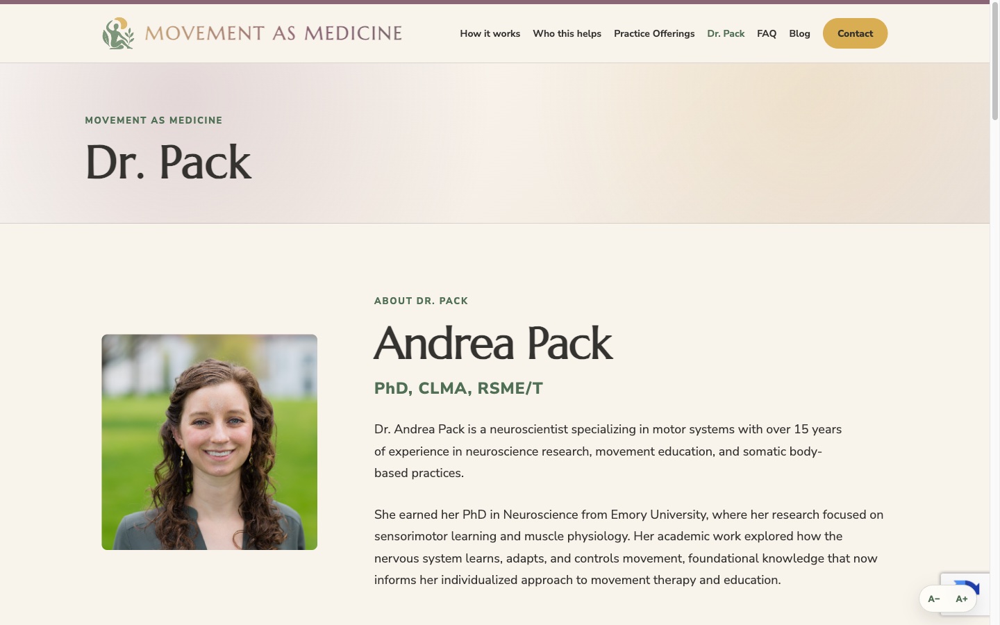
Dr. Pack’s research and professional experience are important differentiators, but presenting them required more than placing a résumé online. The website organizes her neuroscience doctorate, professional movement certifications, certifying organizations, published research, and book contribution into an accessible credentials section.
Supporting the Practice Beyond the Website
The project also included coordinated business cards, professional letterhead, a Bluesky profile banner, social-media sharing graphics, blog graphics, publishing support, and a downloadable professional CV. We also created a monthly reminder system that encourages Dr. Pack to publish a short educational article, helping the website remain active and build long-term search authority.
Collaboration Shaped the Final Design
The finished visual system was not created by applying a predetermined template. It developed through ongoing conversations, careful review, and repeated refinement between Movement As Medicine and Web Experts.
Dr. Pack brought a deep understanding of the emotional experience she wanted clients to have. Web Experts translated that vision into color, typography, spacing, artwork, and motion that could work consistently across a modern website.
We did not rush past details simply because they were subtle. We continued refining them until the website communicated the right feeling.
The Result
Movement As Medicine now has more than a professional website. It has a digital environment designed to reflect the experience of the practice itself.
The colors are warm and grounded. The typography is spacious and approachable. Painted artwork softens the visual identity, while exceptionally slow color transitions introduce movement without disturbing the site’s tranquility.
The smallest details—font colors, gradients, spacing, and transition speeds—help create that result. They may not be the first things visitors describe, but they are a major reason the website feels calm.
This was not simply the creation of a new website. It was a close collaboration to build a thoughtful digital foundation that communicates the care, intelligence, and tranquility at the center of Movement As Medicine.
Want a website built with this level of care? See our web design service, contact Web Experts, or browse more work in our case studies library.